The 5-Day Design Sprint methodology developed by Jake Knapp at Google and Google Ventures is extremely effective. Generally – we run a fairly “classic” version of the sprint. You know – the one that’s described in the book. We have incorporated a few of AJ&Smart’s updates, which they call Design Sprint 2.0, but not the 4-day format which we feel removes the important breathing room (Seth Godin calls it “slack”) where much of the sprint’s resiliency as well as hard-to-measure serendipitous insights can occur.
(For the same reason, we tend to run co-located Sprints only – and fly in when necessary. We try to avoid remote Sprints. Many of our most important sprint conversations happened over lunch!)
But running great design sprints requires more than simply following a rigid recipe. Occasionally, we run into a situation where thinking on your feet and improvising a new exercise is required. When something like this happens, I try to write it down and think how I’d run it better the next time, thus creating a toolkit of exercises we can pull into a Sprint when necessary.
Consider this the first of potentially many such posts.
Extension Pack Name:
The Dashboard Dash
Time Required:
~20 minutes
When to Use:
Whenever a specific screen or page is so complex, containing so many different pieces of information, that we need to quickly align on what makes it in, and how to break it down – before we can go into prototyping it. This is very common with B2B SaaS products, and especially data-driven dashboards.
Where it Fits in the Sprint:
After voting and discussing the sketches, and before the Storyboarding.
Description:
This is a basic noting exercise, similar to the HMWs or Sprint Questions exercise – but minus the voting. It’s meant to allow a very quick alignment around information hierarchy on the Dashboard.
Participants:
Facilitator, Note Taker, the Decider.
Steps:
- Introducing the Dashboard Dash – Finish the sketching and gallery voting exercise first, as well as all the discussions of each sketch and the final Decider vote. The facilitator then says something like: “We seem to have many versions of the Dashboard, with many different pieces of information. So I’d like to and run a special exercise to help us align. We call this The Dashboard Dash.”
(1 minute) - Sketch Breakdown – One person then goes over everyone’s Dashboard sketches, and reads out loud every single piece of information , number, or visual on every sketch.
(5 minutes) - Note Taking – A 2nd person plays the Note Taker, and writes them down on separate yellow sticky notes, and pastes them up on an empty section of the wall.
(Same 5 minutes) - Quick Group Review – Ask the group if anything important seems to be missing, and write down any additional suggestions. Ask the group if anything seems to be superfluous – and with the Decider’s permission – take those down. (Otherwise keep them in.)
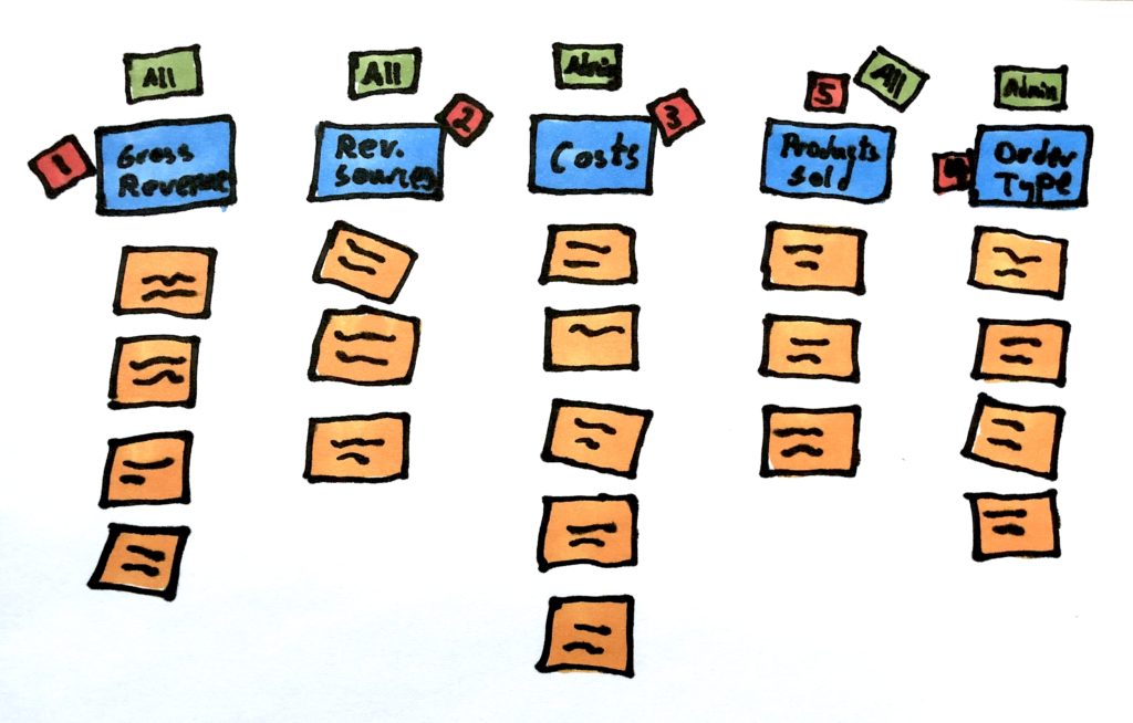
(2-3 minutes) - Categorize into Boxes – Just like we often do with HMWs, start grouping items together into dashboard ”boxes” or page “section” by putting up title cards on sticky noters of a different color above the items in each “box”.
(5 minutes) - Lightning Prioritization – The Decider then goes on and gives each “Box” of information a priority number (1 to however many boxes there are.) This serves to inform the designers during prototyping. They can look at the sketches to be inspired by how people chose to organize the information.
(2 minutes) - Lightning Roles – If permissions is an issue (for example there are different roles who are allowed to see different information), I’ve also used the Decider or someone in the room who’s an expert on that to very quickly note down the permission level on each box.
(3 minutes)
That’s It! The designers now have a consolidated understanding of what needs to be on the Dashboard, that will serve them well when they sit down to design it.
Hope you find this post helpful! I’ll keep posting sprint exercises we find useful on this blog.


